VenueTen
Website redesign
Website redesign
VenueTen is a luxury event venue in Palm Springs. The venue hosts weddings as well as other special events like birthday parties. The property includes several high-end estates to host partygoers, vacationers, or corporate retreats.
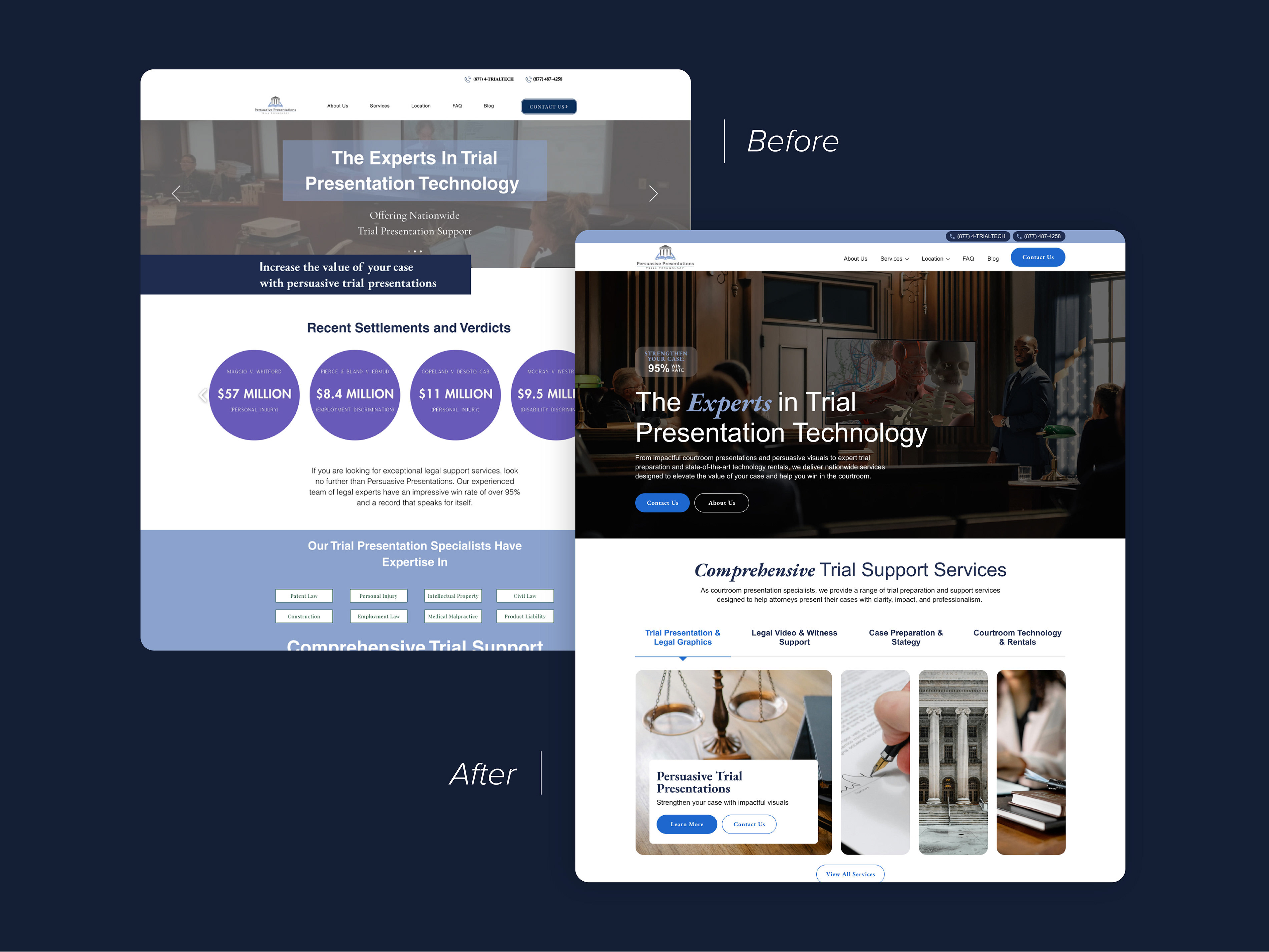
The site was struggling to attract conversions. It appeared outdated and the photography wasn't being utilized effectively. When planning the homepage design, I wanted to better organize the available content and establish the venue's branding while elevating the page with high-quality imagery and modern content layouts.
With this new design, I clarified the typographic hierarchy and incorporated more branding through the use of buttons and icons. I focused imagery on their weddings, specifically lifestyle photos of the brides and grooms celebrating or beautiful ceremony and reception setups. I re-organized the existing content for a better storytelling experience and overall elevated the design to appear more "luxury."
The hero section and first few content sections below it presented a lot of room for improvement. In the original, at first glance the hero image almost makes it seem like they're selling Palm Springs real estate. The text here is hard to read and the primary CTA is almost invisible. Below the hero are a few long lines of text, followed immediately by a newsletter signup form. It doesn't communicate its offerings, doesn't use imagery to establish context, and doesn't provide value. In my new design, I used a high-quality lifestyle image of a bridal party and adjusted the typographic hierarchy of the copy. I added their Google review ratings to immediately establish credibility and trust. I changed the primary button color to make it more visible. Below the hero I included a few paragraphs with overview content about the venue, including capacity and on-site lodging availability. I paired this content with more wedding photos to visually strengthen the user's understanding of the purpose of the site. Overall, these changes help users to more quickly realize the site's offerings and create the perception of a high-end wedding venue experience.
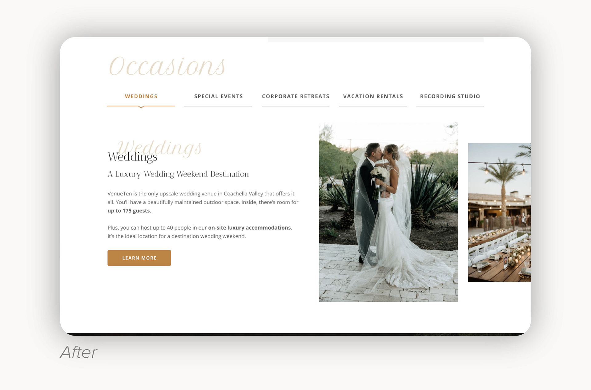
Much of the page was comprised of this z-pattern content, with a few lines describing one of their offerings (weddings, special events, etc.) alongside an image. These each took up a lot of page space and our research found that many users weren't scrolling far enough to see all of the offerings, let alone any of the content below it.
I redesigned the content for these offerings (labeled "Occasions") into a tab format. Users can select a tab to read about that particular offering. This layout encourages user engagement while also shortening the amount of space it occupies on the homepage, increasing the likelihood that users will scroll to see the (newly added) testimonial section just below it.