Trilipiderm
Website Redesign
Website Redesign
Trilipiderm is a premium skincare brand whose site wasn't convincing users to buy their products. They are eco-friendly, the products are all-natural, and they have an 85% repurchase rate - but none of this info was easy to find, and the site design seemed professional but slightly "off."
My mission was to clean up the site and show off the quality of the products. I wanted to highlight the value propositions, give users some information on the science behind the "science-backed skincare," and aid them in finding a product that would best benefit them.
View the live site: https://trilipiderm.com/
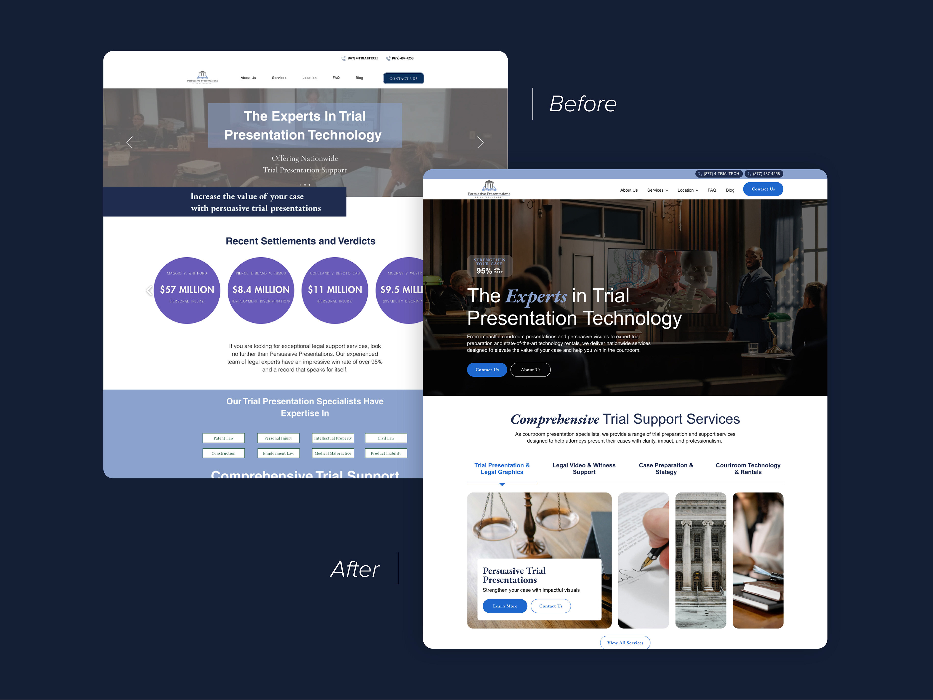
The original site wasn't terrible, but it had a lot of elements that aren't considered "best practice" - for example, they used a lot of imagery with text embedded rather than placing HTML text over the photo. The product listings were simultaneously not informative enough and also giving too much detail (the product names included every single feature of the product). The layout of the page was stagnant, with three full-screen banner images in a row. The only things to click on the page were product listings, severely limiting user engagement and funnel exploration.
In the hero, I chose a photo that better showcased some of their most popular products and also allowed the text to be more easily read. I moved some of the "clean product" badges here to communicate quickly that their products are healthy. I added a couple of buttons to encourage users to explore the products or the product ingredients. Directly under the hero I added value propositions, including their satisfaction guarantee which can assuage any hesitation a user might have about trying a new, expensive product. I added several other content sections that could push a user to different parts of the website and keep them engaged, including one section that allows users to select a common skin concern, which would bring them to a filtered product listing page where they would see their most relevant products.
These benefits were hard to read and the sale banner below it wasn't engaging. From our research we determined that having multiple full-width banners like this was discouraging users from scrolling. The page needed more dynamic layouts to keep the users' attention.
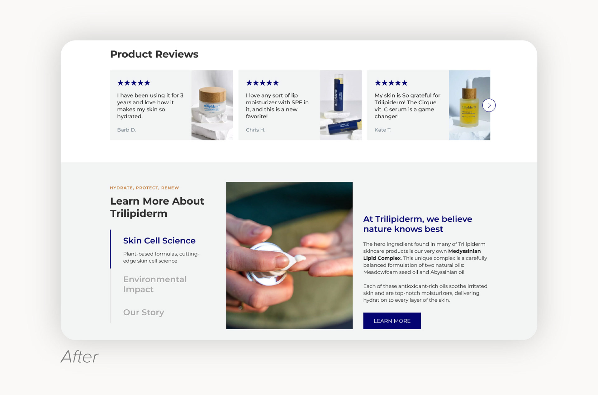
I added a section of product reviews to the homepage to showcase some of the bestsellers and give a preview of some of the satisfied customers' reviews. Below it, I included a "learn more about us" section that gives some context about their "science-backed" claim and the company in general. Presenting this information is intended to increase a user's confidence in the quality and legitimacy of the products and the company that sells them.