ErieMade
ErieMade is an upcoming company focused on supporting the growth of creative personalities in the Erie area. This iteration of the branding was not chosen by the client, but happened to be my favorite.
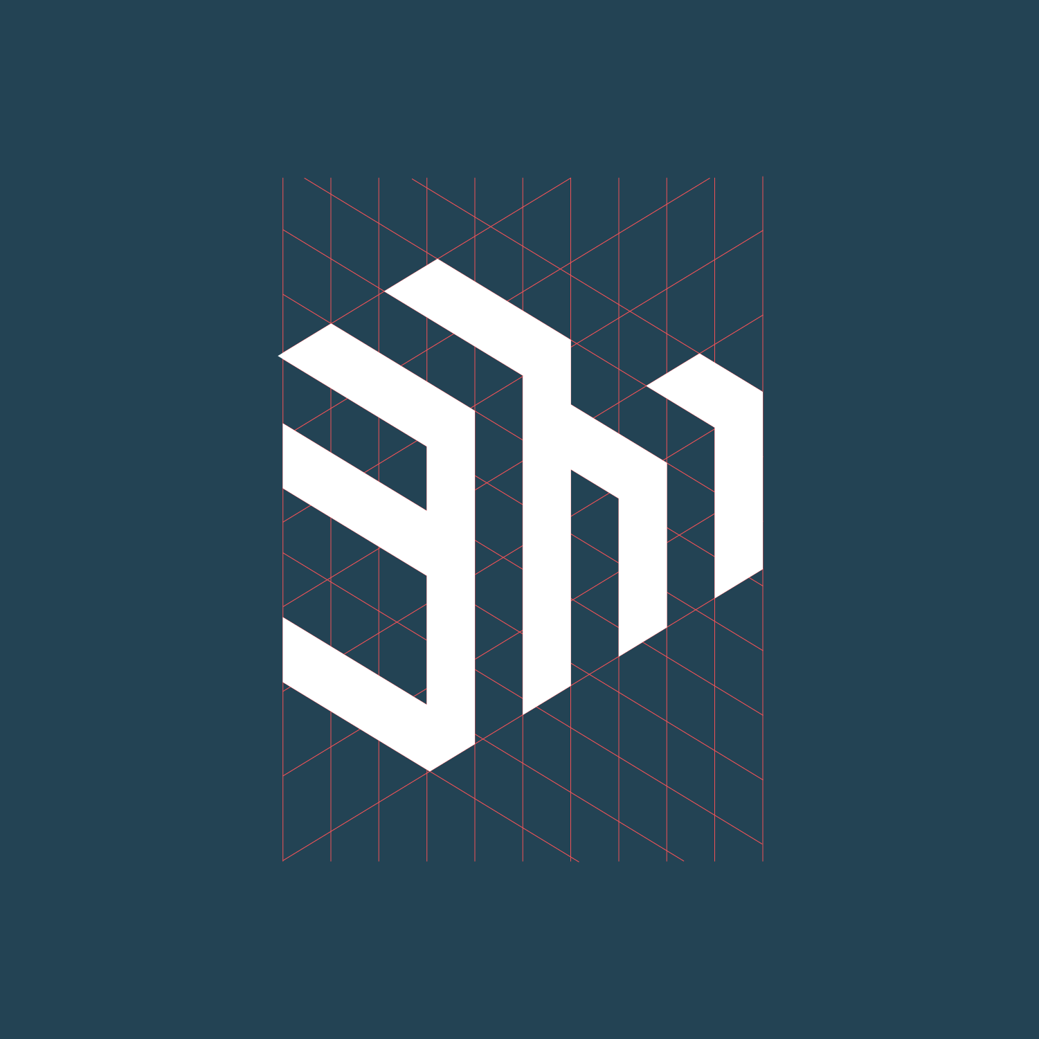
I wanted to choose colors that reminded me of Erie - the blue of the lake, and the reds and oranges of our iconic sunsets. They also really compliment the geometric “EM” shape I created to represent the industrial, “creation” aspects of the city. Depicting the city’s creativity is obviously imperative for a brand whose mission is to support creatives.
