Mai's Perfect Fitz Aesthetics
Website Redesign
Website Redesign
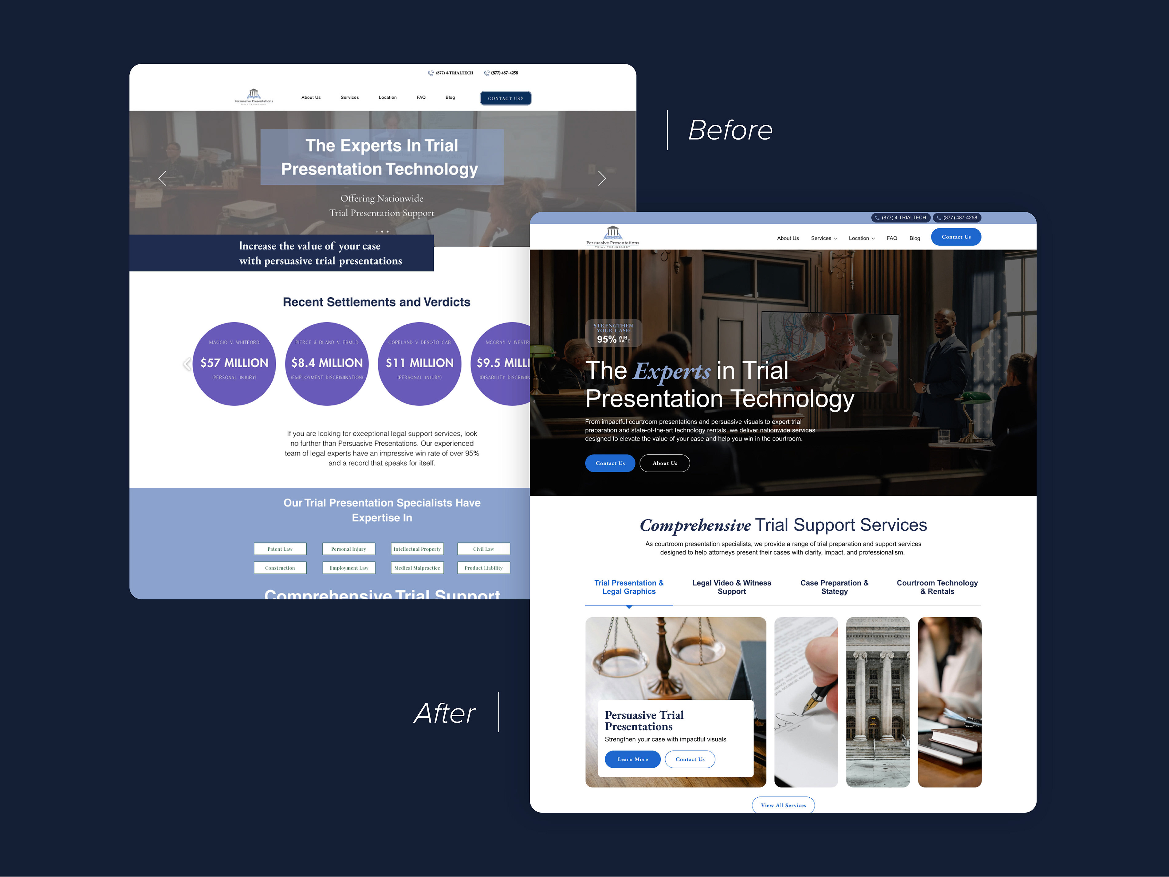
Mai's Perfect Fitz Aesthetics is a med spa in California. Their site was simple, but they were struggling to retain visitors and receive appointment bookings.
The homepage had a lot of disorganized content that was thrown on the page in random headers and paragraphs. My goal was to clean it up and make the med spa look as experienced, modern, and professional as they actually were.
View the live site: https://www.mpfitz.com/
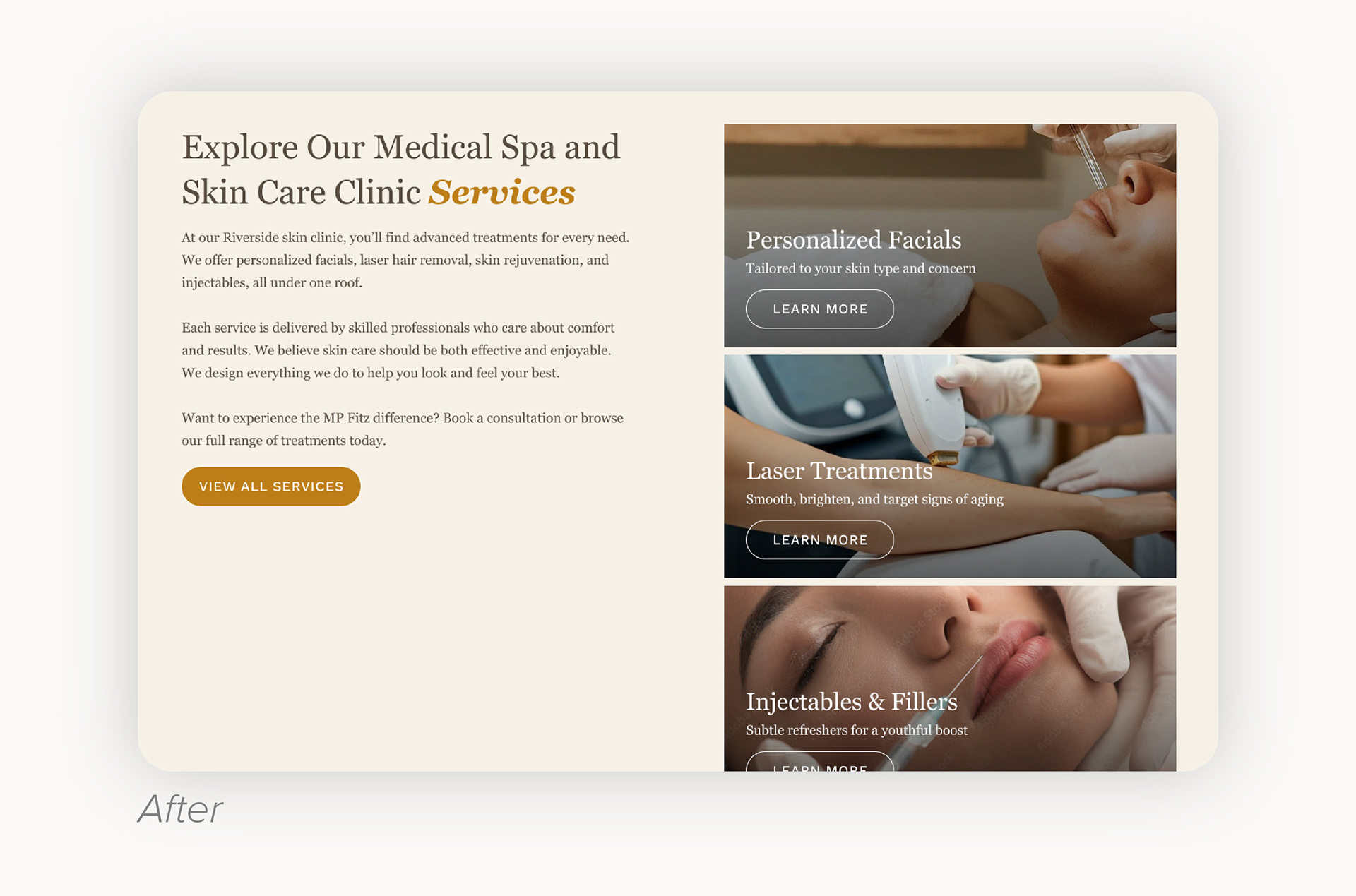
My redesign included a more intentional use of the brand's fonts and more imagery - the original page had almost none. I added a complementary gold color to their color palette to stand out against their beige and gray. I used this color for design elements and buttons (of which I added two to the hero section). I also incorporated their Google reviews into the hero to immediately establish trust and reputability.
I changed the visuals of much of the content, including the newsletter signup, the "results may vary" copy, and the limited time offers. I also added some content such as an "about us" section and user testimonials to increase relatability and trust. All of this lends to a more clearly defined and high-quality storytelling and conversion-driven experience.
This was the bulk of the content on the page. It was just added here with no consideration for visuals, let alone user experience. The lines of text were too long, the services listed didn't link anywhere, and even the email subscription header was confusing - it looks like a giant button.
The first thing I wanted to do was include CTAs to the service pages. I designed thumbnails that featured imagery of the service to entice a user to click and learn more. This is a much more effective way to communicate these offerings than a bulleted list that does not link anywhere.