
Robertson Architecture
Website redesign
Website redesign
Robertson Architecture is a full-service hospitality and residential architectural firm based in Atlanta. During the course of our research, we determined that their site didn't effectively communicate their offerings. The firm was only recently established, so their portfolio isn't as comprehensive as competitors. With these challenges in mind, we moved forward with a redesign of some of their highest-impact pages including the homepage.
View the live site: https://robertsonarc.com/
Some of the changes made to the homepage included re-arranging and re-designing existing content, as well as incorporating new content that would aid in trust and clarity. For example, I added testimonials to the page which can increase a user's confidence in the quality of the firm's work despite not having an extensive portfolio. A "process" section allows users to better understand the offerings and anticipate their next steps after they reach out. A blog feed at the bottom of the page established authority and expertise.
We also determined the hero section needed optimized. The text on the image was difficult to read and wasn't quickly communicating the firm's offerings or value to new users, resulting in high bounce rates. I redesigned the hero to increase text visibility. The new design includes trust-building elements in the form of award badges. I added a secondary button prompting users to view their portfolio of work, one of the most sought-after pages. On the right, I included a graphic that shows a blueprint sketch becoming a rendering, suggesting the comprehensive "beginning-to-end" services offered.
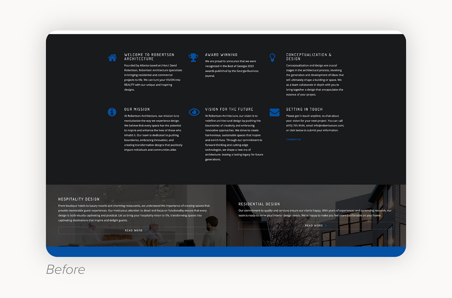
This section originally combined multiple types of content - company background, mission statements, value propositions, and other informational elements - within a layout typically reserved for concise value messaging. As a result, the content lacked visual clarity and clear hierarchy, making it difficult for users to scan and understand.
Below it, the service thumbnails were visually understated, placed low on the page, and featured text that was challenging to read, despite representing key offerings that should command more attention.
In my redesign, I separated the “About” content into its own dedicated section and presented it within interactive tabs to improve readability and encourage user engagement. I also elevated the service thumbnails by increasing their visual prominence and repositioning them higher on the page. These changes improved overall usability, strengthened content hierarchy, and created a clearer path for users to progress through the site and into the conversion funnel.